Texans for Integrity
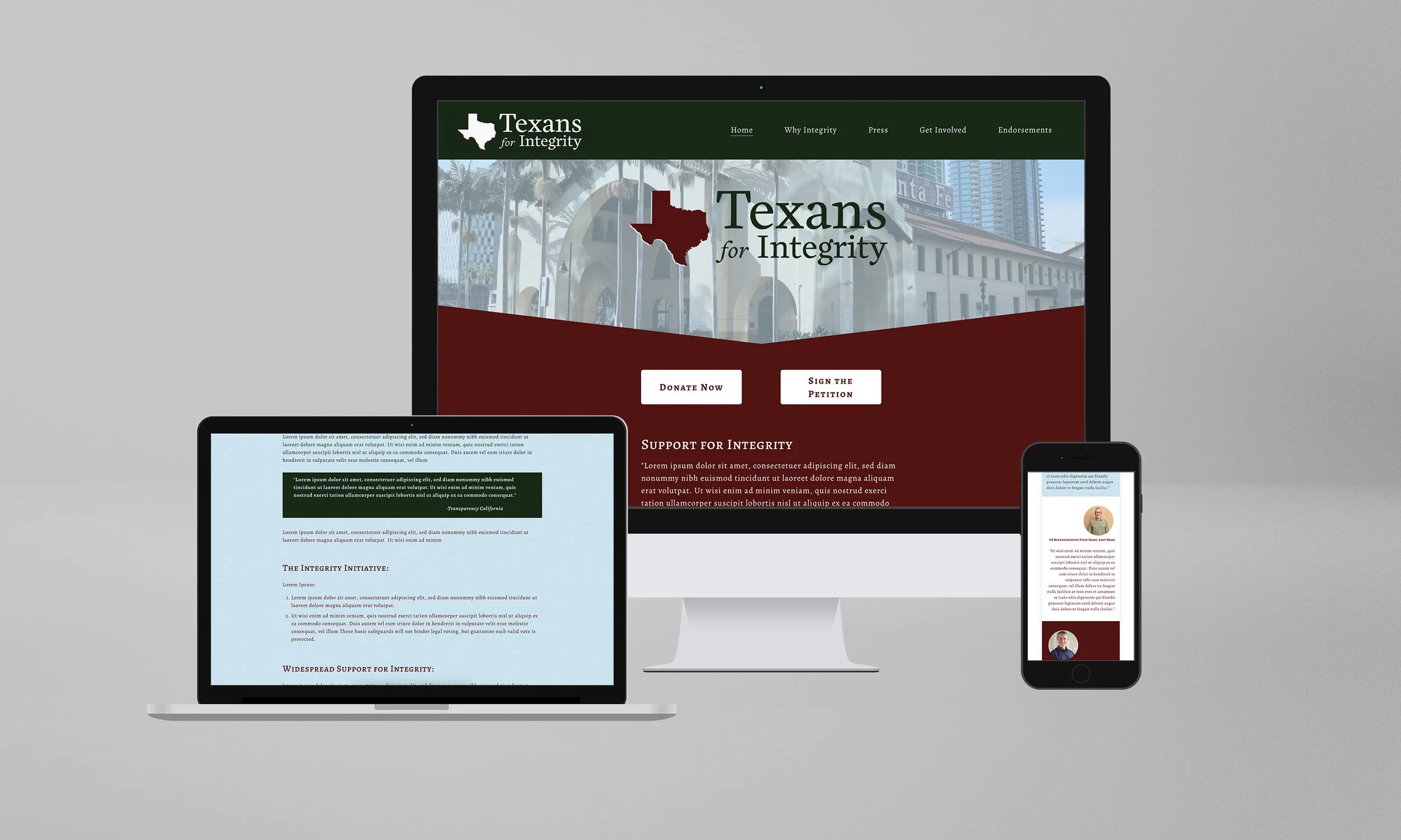
This project combines a refined color system with a clean, responsive web design to establish a cohesive brand identity. The palette—burgundy, soft blue, dark green, and light gray—was selected to balance warmth and authority while maintaining versatility across digital and print applications. The web design applies these tones in a structured layout that emphasizes hierarchy and clarity, with strong calls to action and typography that guides the viewer’s eye. Designed for responsiveness, the site adapts seamlessly across desktop, tablet, and mobile, ensuring consistency and accessibility. The result is a unified visual system that communicates professionalism while remaining approachable.