BRUT PAC
I was asked to create branding for a political action committee with a focus on clarity, credibility, and impact. The work involved developing a visual identity that communicated the organization’s mission across digital and print platforms, without relying on traditional political tropes or campaign aesthetics.
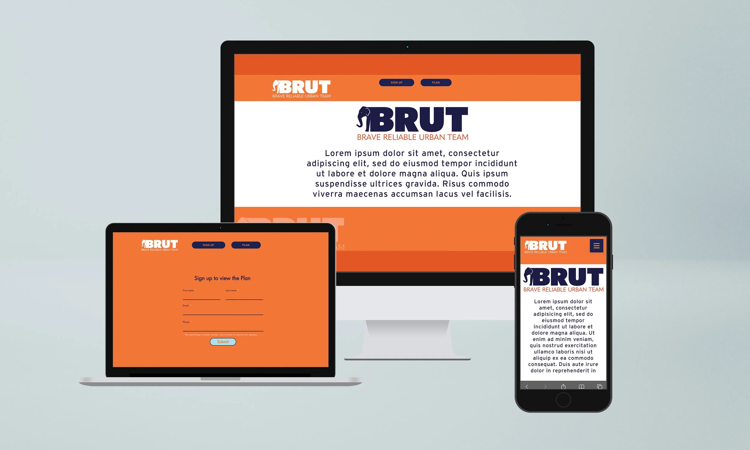
The branding for BRUT (Brave Reliable Urban Team) centers on a bold wordmark that balances strength with approachability. The final logo features an elephant icon integrated into the letter “B,” symbolizing resilience and dependability—qualities that align with the group’s mission. The use of both dark navy and vibrant orange creates strong contrast and visibility, while alternating full-color and reversed versions allow for flexibility across applications.
This final design was chosen for its clarity, versatility, and bold presence. It informed the web and deck designs, which maintain consistency in tone and layout across platforms—ensuring BRUT’s identity remains recognizable and cohesive wherever it appears.